Archives for posts with tag: pixel

Hi all, hope you’ve had a good week. Sorry for missing last week’s post but I was out of town and I had mostly been working on funding submissions and trademark registrations. So you know I didn’t have the most exciting content to talk about.

Anyway this week I finished the background art for world 6. And I had a bit of a personal level up moment when it came to the color pallet. See, for world 5 I spent ages trying to settle on a color pallet that I liked. But ultimately I was pretty unhappy with the result.


So here is the color pallet I used, and here is the finished result as implemented into the game. This color pallet worked well until it really didn’t. It worked well until I had to draw the food stalls in the foreground and then everything started falling apart. And while I was making the art for world 6 I finally understood why.

So I started work on world 6 much the same way I started world 5. I made a pallet and started drawing from within that pallet’s constraints.


This worked great for the little bushes up the front of the scene, but I kept getting the feeling that the dirt and the sky just weren’t working. But still I persisted and stuck with my current course.

World6WIP2

But as I added more and more detail I found things just weren’t adding up. Things weren’t as pretty or as appealing as I hoped them to be. And so I found myself questioning the pallet I made. And I didn’t understand why my pallets just weren’t working. But then I realized that the pallets that I had been using had two major problems.

Firstly they don’t allow me to see the colors effectively in context. And secondly once all I had finished blending colors together, despite having 15-20 colors the viewer would only effective perceive all those as three or four distinct colors (Which often didn’t look good next to each other). And so after some extensive research of different color pallets that I thought would work for the scene on Pintrest, I landed on this configuration.World6Pallet2

So, lets dissect what I was trying to do with this pallet. I wanted to be able to see the 4-7 main colors that would define the scene, much like a traditional color pallet. But I wanted to be able to see what colors would be used as the highlight and shading colors for those main colors. This was so that I could get a better idea of how things would look once shaded. Another nice feature I found out while working with this pallet is that I could quickly see how color groups would look together by covering the colors I wasn’t interested in seeing with a finger.

Now there are some draw backs to this system. This system I think works really well for pallets focus on one color with maybe a complimentary color thrown in (for example mostly green and then some yellow). I don’t know how well this system will work for pallets that utilize a lot of contrasting colors. But I guess I will find that one out as I draw later worlds!

Anyway, once I had my new pallet figured out, I went about replacing the old colors with the new and we ended up with this. Which is so much nicer that if I had just stuck with the old pallet.

World6WIP3

Anyway, I will hopefully see you all next week. But until then, have a great weekend!

Hi all, this week on the Kana Quest DevBlog we are going to look at the background art for world 5. And how I went about making it, and what I think works and what I think doesn’t.

World5Gif.gif

So something that I did much more diligently for this world was deciding on a color pallet from the start and sticking to it. A good color pallet is the base of all good pixel art and the fact that I’ve been so lax about it is kind of ridiculous. And I think it worked to mixed success in this piece. The background houses and park look great within the pallet, but the focus of the piece; the market stalls are less than stellar. w5wip.jpg

As you can see with my first work in progress picture, the park scene starts off pretty good. There is a pretty limited use of the pallet and it looks pretty swanky.

w5wip2.jpg

Then I moved onto the houses behind the park and still the color pallet held out and kept looking great. And not just great, I felt this world was shaping up to be one of my best ones yet. But things all went downhill when I added the stalls.

w5wip3

I don’t know what it was but I did and redid the stalls so many times and they never turned out quite right. I was using the “correct” colors in the pallet, so why did they look so out of place? Honestly I don’t know all I know is, if I’m going to keep deciding on a color pallet at the start I’m going to need to be more careful with the colors that I pick and start with the highest detail thing and then work towards the lowest detail thing.

If you have any tips and tricks that you use for nailing your color pallet please leave them in the comments! I really want to get better at constraining my color pallets down!

Anyway, its a bit of a short DevBlog this week. Hope you have a great weekend!

Hey all, This week we are going to do a review of the Ice Kana mechanic. We’ve done one of these reviews before for the One Direction Kana. Basically what we are going to do is discuss how the mechanic works, how difficult it was to implement, how it plays, and how much design space it has.

So how do Ice Kana work? Ice Kana can be moved in any direction freely but will keep moving the direction they were moved until they hit a non-moving Kana, a blank space, or the end of the level.IceTileDemo2.gif

Ice Kana cannot be moved with each other as if they could there would be situations where tiles would move forever. Also whenever an Ice Kana is moved, regardless of how far they move it is counted as only one move.


So how hard was it to implement Ice Kana into the game? The initial implementing wasn’t too bad. The debugging was the killer for this one. They way the game handles Ice Kana is by checking if either of the two moved Kana are Ice Kana, then if there is an Ice Kana it iterates the “move Kana” script until the Ice Kana makes an invalid move. This was pretty easy to do as it relied on preexisting logic that was solid. The hard part was managing the undo function.  The undo button will log each step of an Ice Kana’s movement as individual moves so I have to tell script at what points an Ice Kana is moved so It can group each of those moves together and undo them all at once. This part of implementation was a nightmare. The last point that was a hassle was the animations. See because I have the Kana faces animated, whenever I want a different set of images for a different mechanic I am forced to make new animations for them. But I hear you saying “Isn’t that a LOT of individual animations?”. Why yes it is. There are 46 base Hiragana, but I have to double that number for each Katakana. Okay so there are 92 animations? Nope, because I have that many animations for EACH mechanic that uses the animation system. So far that is normal kana, stone kana, ice kana, paralysis kana and slime kana. Now slime kana only actually has 16 animations because it is only applies to あ、い、う、え、お、や、ゆ、and よ (I’ll go into why when we review slime kana). But even if we take that into account we still have 384 individual animations. And let me tell you Unity is NOT DESIGNED to have that many animations going on at once. TryingToAddNewAnimations

See this clip is how you add a new animation into Unity. You have to scroll down the list of existing animations until you get to the bottom where you can select the “Create New Animation” button. It is one of the most infuriating experiences I have as a game developer.


Anyway, but I don’t have to worry about implementing it anymore! How does it play? Actually pretty good, it can make some really interesting levels. However Ice Kana are certainly the hardest mechanic in the game for the player. Which I’m fine with. The first three worlds are pretty easy and its good to have a mechanic that can really challenge the player. Personally I enjoy solving these puzzles but what I enjoy and players enjoy are often two different things. So I will still have to do a bunch of testing to make sure the world 4 levels aren’t too difficult. I know for sure that the last two levels of world 4 are by far the hardest in the game.

IceTileDemo3.gif

But I think if I can get the difficulty correct I think players will really like Ice Kana. It will just take a bit of tweaking and balancing to get there.

Finally, how much design space does the mechanic have? Well, LOADS this was one of the first times I finished making a world’s levels and thought “I could probably make another ten interesting levels here”. They interact with One Direction Kana wonderfully, and I am certain they will work really well with future mechanics yet to come. So I am really happy with how they’ve turned out. My one biggest concern is just how difficult players find them.

Wrapping up. I think Ice Kana are a great mechanic that I will probably end up using liberally in future levels, but I do need to be careful of the difficulty. Having some levels be a challenge is fine, but not if players find their brains melting. And while debugging them was a royal pain, I am very happy with where they have ended up.

What do you think of the Ice Tiles? Let me know in the comments! But until next time, have a great week!

Hi all, welcome to the Kana Quest Devblog. This week I’ve been working on making Kana Quest a new logo. Now I’m not going to show the new logo here until it’s 100% done and its been submitted for its trademark application. But I am going to talk about some of the issues I’ve had with the original logo, why pixel art logos are so hard to make, and some of the visual language I’ve learned this week.

Original Logo Issues:

So, lets have a quick look at the original Kana Quest logo. And go over why I’ve concluded this isn’t a very effective logo.

KanaQuestTitleScreenImg

  1. It doesn’t have a clear and readable silhouette. English speakers are strange as most of our ability to quickly identify words come from a word’s silhouette. Because this does not have a clearly visible shape, it is really hard to read at a distance. Give it a try now, stand back from your computer or phone and try read this logo. You probably can’t it all just appears as a blob of different colors.
  2. It is massive in terms of pixel usage. This logo is not small. and it is not scale-able to smaller sizes. The problem with this is that many store fronts have strict specifications of how big your logo can be. And quite simply, the old logo will not fit those specifications. Not matter how hard I try I will never get this logo to fit into a 231×87 pixel image (the smallest image size used in Steam). Also the fact that the logo is less readable than the “press any key” sign under it is all the more damning seeing as how many more pixels it was given to work with.
  3. You need to speak Japanese to read the full title. Seriously, you would think I would have picked up on that problem when I made this but hey.
  4. Contains very little Japanese visual language elements. I’m not talking about the letters here, I’m talking about the visual features and bits of visual language that are often utilized in Japanese logo making. If I had used these elements then they would infer to the viewer that this game has something to do with Japan even before they see the Japanese written.
  5. Very little contrast to guide the viewers eye. So generally speaking we will focus on the part of an image that has the most contrast in value. If you don’t know “value” is how light or dark a color is.  Look at the greyscale version of the image, there is more contrast in the background that there is on the actual logo. So you spend most of your time looking at the wrong thing.logogreyscale

Things to Do/Not Do When Making Pixel Art Logos:

So, the original logo is bad. Really bad. But if you were thinking making your own Pixel Art Logo what are some things should you do and look out for?

  • This is an obvious one, but I genuinely didn’t do it when I made the first logo; Look at lots of other logos. Find logos with the same the feeling that you want to evoke in your viewer. What are the common elements between those logos? What’s different? How do those differences affect the feeling you get from the logo? Once you’ve done that borrow those common elements and use them in your own work.
  • Draw a bunch of logo’s on paper before you start. I made the first Kana Quest logo going straight into pixel art. This was a mistake. Its really hard to effectively try out ideas when you are drawing within the a constraints of pixel art. Below is a logo I made sketching straight into pixel art within Photoshop. While it is better than the original logo, its honestly half as good as some of the warm up sketches I did in paper this last week. If you find it easier to sketch digitally than physically then do that instead, but do some non-pixel art sketches first.

AnimatedLogo1Gif

  • Beware of overlapping shapes (for example overlapping letters). This is less dire if you have more pixels to work with, but overlapping shapes require a lot of defining so the viewer can easily process what’s on top and what’s underneath. And if you are using pixel art, you might not have the pixels to do this. This isn’t a “avoid at all costs” rule, but it is something to be careful of while you are sketching (Also you might notice that I have overlapping letters in the original logo, and it just makes things harder to read).
  • Check that your logo looks good on many different backgrounds. Its fine to have a background color that makes your logo “pop” the most, but if it looks bad on flat black, white or grey there is a good chance you’ve made a mistake.
  • Don’t go with your first design. Seriously, don’t I don’t know why I decided I thought it was a good idea to do so for the first Kana Quest logo, but it was a terrible idea. Don’t fall into that trap.


Japanese Logo Visual Language:

So while I was doing research for my logo this week I wanted to figure out what were  the most commonly used pieces of visual language used in Japanese game logos. And I ended up identifying three common elements (all of which I’ve utilized in my new logo). And of course, not all Japanese game logos use these elements, but a very large amount do. And they use these elements more often than western games.

To this end, look at the Japanese logos for Pokemon Sun and Moon. These logos are great for demonstrating three aspects of design that are common across a large amount of Japanese game logos.

JapaneseGameLogos.jpg

So the common elements are as follows.

  1. Letter Stroke Border:  So most logo’s will have some form of border around the title text of the game. These borders have a large amount of variation depending on the type of game. The width, the roundness/sharpness, the color and shading of the border are all important of communicating the game’s identity. The reason I bring this up as a feature of Japanese visual design is that it is far more common for there to be no border around the letters in a western game’s logo. For example the logo of Skyrim has just the plain text and no border. Or you could look at Dark Souls: A Japanese game that has a deliberately western looking logo by omitting the letter border.
  2. Subheading: While not as commonly used as the letter border, this is a far more commonly used aspect of design than in western games. The most common use of the subheading is to write the name of the game again in a more easily readable text. Often games with a name written in Kanji or English will have the name written out in subheading in Katakana or Hiragana for this very purpose. Another common use is a brief description of the game or as a visual ” : “. The main variations between subheadings are the placement, and font differentiation. Also subheadings are way more likely to forgo a Letter Border than the main logo.
  3. Visual Flourishes:  These are the least distinctive to Japanese logo design when compared to the first two, but they are an important part of the design. These flourishes are often incorporated into the Title’s letters and often use something emblematic of the game (see the pokeball and the Lunala/Solgleo symbol in the Pokemon Sun/Moon logo).


Anyway, that’s all there is for this week. I look forward to being able to show you the new logo when its safe for me to do so, but until then have a great week!


Hi all, welcome to the Kana Quest Dev Blog, after two weeks of forgetting that this is something I do I’m back. Truly I am the most consistent of self marketers.

Self deprecation aside, what are we talking about today? We are going to talk about the background art for world 4 got made, and what I learned along the way.

So before I started work on Kana Quest I had never worked with Pixel Art before. Not because I didn’t like it, just because I’d never given it a go. As you can expect this caused me to have quite the learning curve. I didn’t know about many of the common techniques, hell I didn’t even realize you were only supposed to use as few colors as possible (The first world is really bad for breaking this rule). But each world I’ve done, I’ve gotten a little bit better at it.

So what did I do differently for this world? Well for a start I used much fewer colors in sky. All previous worlds I had five colors making up the sky colors (most of which I would not reuse). This time I condensed that down to three (not including the purple at the top there as that has to stay consistent between worlds now for GUI reasons). And all three of those colors would be reused in the rest of the scene.

world4wip1

At this point this image only contains 8 colors, much fewer than my previous worlds.

Here you can see me start to reuse the colors already, the city buildings used the fuchsia at the bottom of the sky, and the roofs of the foreground buildings used the icy blue from the top of the sky. Speaking of reusing things, I got to reuse those foreground buildings. Copy pasted straight from world 2, scaled down, and recolored.


world4wip2

And with the station, the number of colors total is 14.

For the train station I used a lot of reference photos of other pixel artists to help get the effect I wanted. I know its nothing to be ashamed of (using reference photos) but I always try to do it without even when I shouldn’t. This is more for me than anyone else but, Always use reference photos, it makes life so much easier.

A couple of small details to look out for in the train station. The train shelter has my name written on it (テオ = Teo, basically the closest you’ll get to “Theo” in Japanese). The vending machine says うまい (umai) which means yummy, and the train station says 竹田 (Takeda). Which is the name of one of the towns in the area of Japan that I lived. I would have put down 朝来 (Asago, which is the name of the area I lived) or 和田山 (Wadayama the town I actually lived in), but I couldn’t write either with the number of pixels I had available.

World4Finished.gif

The finished background art. Total of 16 colors.

The final thing I added was some more frost on the train tracks and some clouds. I added one new color for the shading of the clouds and let that color have a pretty high contrast to the rest of the clouds. Something I’m still getting the hang of with pixel art is the need for higher amounts of contrast in the area I want people to focus on. I know its a pretty basic compositional thing to forget, but its something I frequently forget to do. So from now on I’m going to try keep it in mind more often.

Anyway, that’s all for this week. Making this background was a bit of a level up moment for me, so if you’ve had any level up moments in pixel art, design or anything really I’d love to hear them! Until then, take care.

The devblog is back! Sorry for such a long hiatus, but we are here and a lot has happened!

But today we are talking about World 3. Just before Christmas I finished making the background art and the one direction tiles so I would be ready to make some levels!

World3Level1

All the levels for World 3 are now complete! Something I might do every time I finish making the levels for a world I might “review” the mechanic deployed therein. I’m going to judge a mechanic on a few different criteria. Most of these are normal things to consider for all game design, but the last is relevant specifically to Kana Quest.

  1. Complexity of the mechanic. (How long does it take for the player to figure out how it works? How much mental strain does it cause the player?)
  2. Design Space of the mechanic. (This is another way of saying how deep is the mechanic? How many interesting scenario’s can it be used in? Does it interact in interesting ways with other mechanics?)
  3. Fun Factor of the mechanic. (Just simply, how fun is it)
  4. Ability to help teach Hiragana. (Does the mechanic play help the player to remember what a Kana is or learn new Kana?)

So how did one direction tiles do? Very very well, they have a very low complexity so much so that a tutorial is often not needed for play testers, and it has a large design space! The fun factor is a bit subjective, but personally I find it quite fun. The only strike against one direction tiles; they don’t really teach Hiragana very well. They don’t work against that goal, but they aren’t any more useful than a normal Kana tile.

The only other problem with one directional tiles is they require a large level to be interesting. World3Level20.jpg

Due to a bunch of mistakes that I made when setting the game’s camera up, I have a hard upper limit to how big a level can be. On the whole this isn’t too bad as it forces me to keep the complexity down but it does mean that for mechanics like the one direction tile, I can’t use it to its fullest extent.

But on the whole I give one direction tiles a B+. Its a good mechanic that can be used to make interesting levels.

Before I leave you today, I just want to share my personal favorite level from World 3.

World3Level16.jpg

This what the first of a series of levels that I made where the player has to figure out the correct place to start matching the Kana. In each row there is usually only one Kana that will match with the row above or below it. Thus making the physical size of the level and the positioning of the tiles crucial to being able to complete the level.

World3Level16Complete.jpg

Anyway, I hope you all have a great week, and I will be back posting regular devblogs again from here on out! I will try for once a week, but if I’ve just been squashing bugs that are not very interesting then it will probably get pushed back.

And here we are, the end of 2017. In March this year I decided that I should be devoting all my time and effort into finishing Kana Quest. So much has changed over the course of these months and I decided as a way to wrap up this year we would look at how Kana Quest has evolved.

Just a heads up I will likely not get every detail in the chronology perfect. This is just a chance for me to look back and see how much I’ve achieved this year.

March-April 2017:

So here is where we began the year. Kana Quest was something I had worked on every now and again since 2015. And to be honest not much was happening with it. But after taking a long hard think about where I wanted to be professionally in the next 3-4 years I realized Kana Quest was the best way for me to get there.

Below is the closest I have to footage of what the game looked like at the point I started work.

But the big push that got me to work on Kana Quest was AVCon. I had seen a post in the Melbourne IGDA page for devs who were interested in showing off in Adelaide. And I decided, I should do it. So the first thing I started work on was the Sakura background of the first world. I didn’t need to have the whole game done, I just needed the first world or two done so that folk could get an idea of what the game is like.

March was also a big milestone for me as it was the first time I took Kana Quest to the Melbourne IGDA meetup. Where I learned that my puzzles were hard to see, the matching effect was hard to see, and my tutorial was terrible (I’m *never* gonna hear that last piece of feedback *ever* again 😛 ).

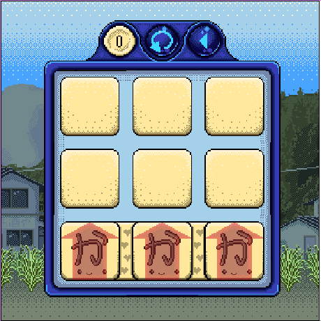
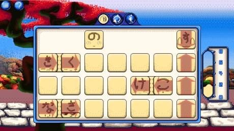
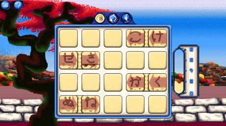
About mid April I decided that Kana Quest had very little in the way of character, so I decided to try experimenting with anthropomorphized Kana tiles in an attempt to fix this.

The last thing I started working on before the end of April was a backdrop for each puzzle so that the player could see the important information more easily.


May – June:

After making the design for backdrop in late April, May involved me actually implementing it. This meant sectioning each part up so that Unity could create a different sized background based on each level, this honestly proved to be much easier than I thought it was going to be.

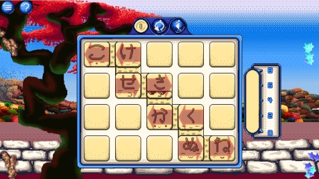
Then came the implementation of the Cute Kana. Following a positive response to the experiment I did in May, decided to make all the Kana have cute little faces to give them character.

Of coarse the hard part was managing all these new animations attached to the same prefab. Which led to this nonsense. Actually the current animation tree is even more messed up. Here I only have the normal Kana animations hooked up, not the stone kana, none of the Katakana variants, and none of the other mechanics. Sooooo yeah navigating my animator panel is hell now :/

Late May and early June was where I started putting more effort into my tutorial, rather than just explaining to every person who played it what one earth was going on.

Another massive change in this time period was changing how tiles moved so that they would move with the mouse when they were dragged. This improved the feel and user experience of the game massively.

And I also added a medal system so that players could kind of choose their own difficulty setting. This meant players weren’t punished so harshly for not being able to finish the level in the minimum number of moves.

July – August:

This is the point in time where I knew that I had been accepted into AVCon, and the countdown to that was coming. So I buckled down on making everything look as pretty as I possibly could, by reworking old bits of UI to make them work with Kana Quest’s new look.

But the most important part of July was AVCon, and it was amazing.

It was the first time I got to see non friends and non game dev people playing my game and it was such a cool experience. And I got to meet Carmine the developer of Icebox: Speed Gunner and quite a few people from Team Cherry; the makers of Hollow Knight.

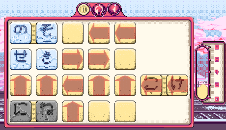
Shortly after I got back after AVCon I finished implementing Katakana into the game.

Its always been the plan to include Katakana in the final game free of extra charge. Most of Kana Quest’s direct competition all include it as additional DLC or as a sequel and I wanted to offer my players greater value for their money.

But once I had my Katakana in, my count down to PAX truly began. There were three things I needed to get into the game before PAX. A better tutorial, world 2 being implemented, getting it working on Android and sound. As I had been working on world 2 in the lead up to AVCon I decided to get that done first.

And by the end of August I had basically all but finished making world 2. Leaving me two months to work out the sound and tutorial.

September – October

So these were the last months before I would take Kana Quest to the biggest stage it had ever seen. I was stressed beyond belief. Originally I planned on making the music for Kana Quest myself, but a quickly realized that it would take me way too long for me to do. So I decided to employ the amazing Nicole Marie T (https://twitter.com/musicvsartstuff) for the music. Not only did she manage to compose me three different pieces of music within a very tight time window, but she also produced a product of much higher quality than what I could have produced if I did it.

Since I had Nicole on music and I’d managed to get World 2 done pretty quickly I was able to work on porting the game to Android. And let me tell you, there is a reason every indie dev and their dog seems to use Unity. That reason is porting your game is obnoxiously easy. I had it ported within the first week of September.

With three out of four things basically taken care of so early I was thinking, maybe PAX will be fine. After all I just have to fix up the tutorial and I’ll be perfect.

Rule one of game design: never ever think “oh this will be easy”. Because if you do, it wont be.

First thing I changed to make learning the game easier was the completion gauge. The idea being that if the player could see the how close they were to completing the level visually it would help them learn the goal faster.

Even once the gauge was added I didn’t finish reworking the tutorial until the end of September.

Then I made one laaaast minute change that I probably shouldn’t have.

See I have a game reset function in Kana Quest if I want to reset the memory. Thing is I forgot to factor that in with the hint screen so the hint screen would never go away once the memory was reset. This was a problem at PAX as we had to restart the application every time this happened. Fortunately this was the worst bug I encountered during PAX.

November – December:

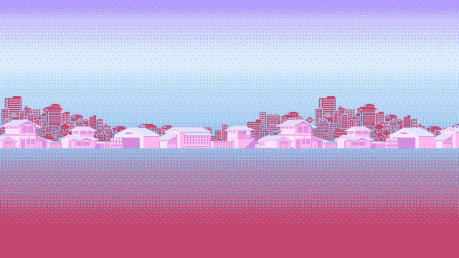
Honestly not much got done over these last two months. About the only major thing I achieved was finishing the art for world three. The main reason I didn’t get a lot done was I was just burnt out from doing PAX.

Anyway. I look forward to writing for you all in the new year until then take care.


Hi, sorry for missing last week’s devblog. Was just working on stuff that wasn’t very interesting to show off, so I decided to leave it be. But this week we have some fun stuff to look at!

First up is World 3 is in the game!World3Animated.gif
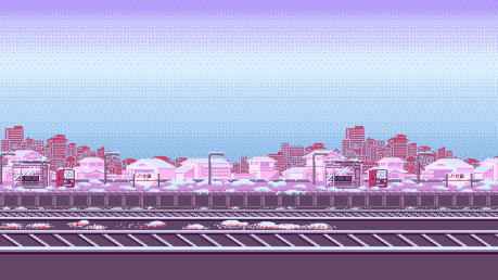
Well, at least the art assets are in the game. Getting the art in can be a bit arduous. First thing I have to do is position all the sprites so that they line up with the previous world’s sprites, then I have to create a new parallax manager for this world. All this does is it manages the different layers and makes sure they move the right amount. Then I have enter in all the sprites into the correct layer and set the movement modifier for each layer. Its just one of those things that isn’t complicated but just takes more time than you think.

Speaking of things that aren’t complicated but are time consuming: Pallet Swapping. So something I do for each world is I create new color variations on my UI. This is so my UI matches the color of whatever world the player is in.

This is not a complex task, but boy is it ever mundane. Open file, select color, replace color with new color, repeat for remaining colors, save, repeat for the next 80 something UI elements. Doing all the UI recolors took me about 75% of a full day to finish. The evening that I finished doing them I was talking to a friend and realized that if it took me most of a day to do the recolors if I had to repeat that process 15-20 more times that would take up most of a month to do. Not great. So I had an idea, I’m going to spend a day or two making a unity plugin that automates the process for me. You just give Unity all the files you want it to modify, each of the colors in the original sprite, each of the new replacement colors, where everything should be saved, and what naming convention it should apply. And when all is said and done I should even be able to sell it on the Unity Asset Store for a buck or two.

Finally I got the bare-bones of the next mechanic into the game. OneDirectionTilesVer1GIF

These are One Direction Kana. They can only move in one direction… also they love Harry Styles. They are “functionally” complete in that you can’t make any invalid moves with them but the game currently lets drag the Kana in the direction of an invalid move, it just then pops it back to where it began because it was an invalid move. I’m also not completely sold on the visuals of the mechanic yet, but hey its a placeholder so it will change soon enough. Anyway I decided to make this mechanic the next mechanic because its a pretty simple mechanic for the player, and it doesn’t have a requirement of learning more Kana to make the mechanic work (unlike the Mystery Kana). This is important as the start of Kana Quest has a really high learning curve, and I need to give the player a breather and some time to revise the Kana they’ve seen.

So before I head off, next week (23rd/24th) will be the LAST Dev Blog for 2017 (as the following Saturday will be my birthday and the day after that is new year’s). So what we’re going to do is, take a look at what’s changed with Kana Quest since I’ve been working on it full time. Just to see how far we’ve come.

Anyway, until then, Have a great weekend and Happy Holidays!

Good morning all. Sorry I missed last week. I was mostly still working on the new logo still and I didn’t want to publish the final finished version until I had bought my trademark for it.

But this week I’ve started work on the next world for Kana Quest. w3WIP2

So this week we are gonna look at some of the techniques I use when making these background, the way I set these things out and the inspiration for this one.

So right off the bat you will notice the biiig blank space in the second half of the picture. why is that there and what am I using it for? Well the backgrounds in Kana Quest have to repeat seamlessly. But they also have to transition nicely from the previous world. So what I’ve done here is I’ve drawn the connective tissue first but leaving a lot of room in the document so I can then draw the repeating part of the art.

Another thing about the setup of this image that you cannot see is the layer structure. Because the backgrounds will be parralaxing I need to choose what part of the background goes on which layer. And then work from the furthest back to the closest. The reason I do this is so that if there are any variations in a foreground layer’s height I can make sure the background layers still have stuff there so we don’t get a big gaping hole.

So now onto the techniques I use to make this a lot faster than hand placing every pixel. Whenever you are doing dithering (the process of creating a dot pattern to create the illusion of shading) in photoshop the paint bucket is your best fried. Let’s say we were going to make a bunch of autumn trees like in the background.

pixelart demo1

The first thing we would do is jut get some flat base colors like this. Looks pretty nasty right? But once we add some shading everything will look great. The only problem is no one wants to sit around and place all those pixels by hand.  So what we are going to do is select the areas we want shaded and use the hue saturation adjustment layer to alter those selected areas. Then we fiddle around till we have a shading color that we like. And we get this.

pixelart demo2

Then we will make a selection were we want the “in-between” of the two tones to be. I like to select the shade color with the magic wand and go to Select –> Modify –> Expand and expand an appropriate amount.

Then once we have that selection I go to my paint bucket and switch the mode from Foreground to Pattern. Also make sure you define a dither pattern beforehand (this is done in basically the same way you define a new paintbrush). Then just fill with your bucket and it will look like…. trash. But that’s ok.

Untitled-1

What we are going to do with this is use it to create a selection that will allow us to immediately fill up the black pixels with the chosen shade color and then delete the white pixels leaving us with a perfect dither pattern. Like so.

pixelart demo4

This is great because we get to have dithering in our piece without having to do any of the laborious pixel by pixel shading. Then for the final step we just repeat the previous steps for the highlights and we get this.

pixelart demo5

Seeing as these are supposed to be trees I would recommend adding some irregularity to the shading. But adding that is much faster when you have a good guide ready to go.

Finally I’m going to talk about the inspiration for the art for world three.

I wanted the first four worlds to follow a full year season cycle to begin with. The world one starts with spring and the world two is summer, so world three is of course autumn. What this means for the art is there needed to have Japan’s stunning autumn colors on display. But I also wanted to shift the perspective of the art. Spring and summer are both warm and optimistic times. Autumn is a shift, so while the color pallet is still very warm but I wanted it to be more introspective by bringing the focus to the foreground. As a result I have the brilliant red of the Japanese Maple trees the closest thing to the player. This way when we transition to world four when the mise en scene is even more cramped it wont be as much of a visual jump.

Anyway, there is still a lot of work to be done on the background before it’s finished but I’m sure I’ll get to show you the finished thing soon!

Till then, take care and have a great day!