Archives for the month of: April, 2018

Hi all, this week on the Kana Quest DevBlog we are going to look at the background art for world 5. And how I went about making it, and what I think works and what I think doesn’t.

World5Gif.gif

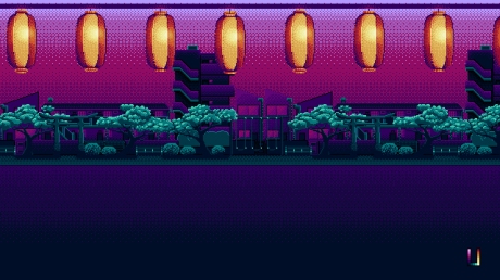
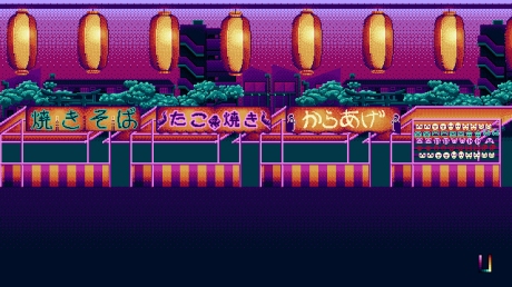
So something that I did much more diligently for this world was deciding on a color pallet from the start and sticking to it. A good color pallet is the base of all good pixel art and the fact that I’ve been so lax about it is kind of ridiculous. And I think it worked to mixed success in this piece. The background houses and park look great within the pallet, but the focus of the piece; the market stalls are less than stellar. w5wip.jpg

As you can see with my first work in progress picture, the park scene starts off pretty good. There is a pretty limited use of the pallet and it looks pretty swanky.

w5wip2.jpg

Then I moved onto the houses behind the park and still the color pallet held out and kept looking great. And not just great, I felt this world was shaping up to be one of my best ones yet. But things all went downhill when I added the stalls.

w5wip3

I don’t know what it was but I did and redid the stalls so many times and they never turned out quite right. I was using the “correct” colors in the pallet, so why did they look so out of place? Honestly I don’t know all I know is, if I’m going to keep deciding on a color pallet at the start I’m going to need to be more careful with the colors that I pick and start with the highest detail thing and then work towards the lowest detail thing.

If you have any tips and tricks that you use for nailing your color pallet please leave them in the comments! I really want to get better at constraining my color pallets down!

Anyway, its a bit of a short DevBlog this week. Hope you have a great weekend!

Hey all, This week we are going to do a review of the Ice Kana mechanic. We’ve done one of these reviews before for the One Direction Kana. Basically what we are going to do is discuss how the mechanic works, how difficult it was to implement, how it plays, and how much design space it has.

So how do Ice Kana work? Ice Kana can be moved in any direction freely but will keep moving the direction they were moved until they hit a non-moving Kana, a blank space, or the end of the level.IceTileDemo2.gif

Ice Kana cannot be moved with each other as if they could there would be situations where tiles would move forever. Also whenever an Ice Kana is moved, regardless of how far they move it is counted as only one move.


So how hard was it to implement Ice Kana into the game? The initial implementing wasn’t too bad. The debugging was the killer for this one. They way the game handles Ice Kana is by checking if either of the two moved Kana are Ice Kana, then if there is an Ice Kana it iterates the “move Kana” script until the Ice Kana makes an invalid move. This was pretty easy to do as it relied on preexisting logic that was solid. The hard part was managing the undo function.  The undo button will log each step of an Ice Kana’s movement as individual moves so I have to tell script at what points an Ice Kana is moved so It can group each of those moves together and undo them all at once. This part of implementation was a nightmare. The last point that was a hassle was the animations. See because I have the Kana faces animated, whenever I want a different set of images for a different mechanic I am forced to make new animations for them. But I hear you saying “Isn’t that a LOT of individual animations?”. Why yes it is. There are 46 base Hiragana, but I have to double that number for each Katakana. Okay so there are 92 animations? Nope, because I have that many animations for EACH mechanic that uses the animation system. So far that is normal kana, stone kana, ice kana, paralysis kana and slime kana. Now slime kana only actually has 16 animations because it is only applies to あ、い、う、え、お、や、ゆ、and よ (I’ll go into why when we review slime kana). But even if we take that into account we still have 384 individual animations. And let me tell you Unity is NOT DESIGNED to have that many animations going on at once. TryingToAddNewAnimations

See this clip is how you add a new animation into Unity. You have to scroll down the list of existing animations until you get to the bottom where you can select the “Create New Animation” button. It is one of the most infuriating experiences I have as a game developer.


Anyway, but I don’t have to worry about implementing it anymore! How does it play? Actually pretty good, it can make some really interesting levels. However Ice Kana are certainly the hardest mechanic in the game for the player. Which I’m fine with. The first three worlds are pretty easy and its good to have a mechanic that can really challenge the player. Personally I enjoy solving these puzzles but what I enjoy and players enjoy are often two different things. So I will still have to do a bunch of testing to make sure the world 4 levels aren’t too difficult. I know for sure that the last two levels of world 4 are by far the hardest in the game.

IceTileDemo3.gif

But I think if I can get the difficulty correct I think players will really like Ice Kana. It will just take a bit of tweaking and balancing to get there.

Finally, how much design space does the mechanic have? Well, LOADS this was one of the first times I finished making a world’s levels and thought “I could probably make another ten interesting levels here”. They interact with One Direction Kana wonderfully, and I am certain they will work really well with future mechanics yet to come. So I am really happy with how they’ve turned out. My one biggest concern is just how difficult players find them.

Wrapping up. I think Ice Kana are a great mechanic that I will probably end up using liberally in future levels, but I do need to be careful of the difficulty. Having some levels be a challenge is fine, but not if players find their brains melting. And while debugging them was a royal pain, I am very happy with where they have ended up.

What do you think of the Ice Tiles? Let me know in the comments! But until next time, have a great week!

This week we’re gonna do something a little different. Instead of looking at what’s changed or been made for Kana Quest, we are going to look at the non-game related problems that I’ve encountered in making Kana Quest. In other words we are looking at how I use self care to keep on going.

See I have been working solo on Kana Quest full time for a year now and working solo has some great advantages, if I get bored of doing one thing, I can always switch tasks and continue on with something else. I get to have very low overhead costs. But despite these boons, they don’t make up for the fact that working alone is REALLY lonely. Sometimes its nice to not have to deal with people and make creative compromises. But I have found these times are not the norm. And you really do miss having someone around who can sanity check your work. And the worst thing about being a solo dev is you start getting something similar to cabin fever. You will start thinking illogically and getting cranky for no real reason. I’ve found it is so easy to let yourself slip into destructive thought patterns if I’m not careful.

So how do I try dealing with this? Well I try get out and see people. I make a deliberate choice to make time to go and talk to friends. But not just friends, I force myself to go to local game developer meet ups. Game developer meet ups are a great opportunity to talk to other (and in my case more experienced) game devs. Some of the best changes I’ve made to Kana Quest have been suggestions from folk I’ve met at my local game dev meet up.  Just make a mental note to be super extra polite. I go stir crazy from not interacting with people, and its really easy to find myself getting a bit snappy. I don’t want to do that. Folks are doing me a favor by giving feed feedback, and I try to appreciate and respect that.

I reckon I need this tattooed to my retinas sometimes.

Another big problem is simply maintaining motivation. Simply getting yourself to keep going is a really hard thing to when you are are utterly sick of something. And when you’re the only one making something, you get really, really sick of it. So something that I do is that I will keep a list of small and easy things. In other words I give myself an easy win. This way if I ever find myself utterly stuck and overwhelmed with everything, I can get something done. And once you find you’ve achieved one thing you find it easier to do more.

Yaaay, I’m so amazing I fixed a tiny non noticeable detail.

But sometimes I find this trick doesn’t work. These are the days that I just want to throw the towel in. Give up. What I do is go onto Twitter, and Pintrest, and just search for inspiration. Find images and games that I think are cool. Maybe try replicate some techniques that I see (to the best of my ability) and see what I can learn. Its not about comparing who’s work is “better” (because often mine is worse) its just about appreciating other people’s work. And wanting to do what other people can do too.

Yup, I’m working, I swear

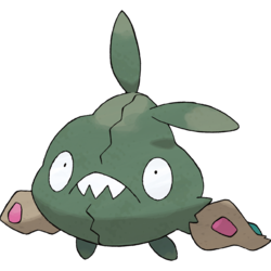
But sometimes I end up thinking “they are so much better than me, I’m trash, I’ll never be that good”. In which case I have to force myself to come up with some logical arguments against that line of thinking. E.g. They are so much better than me –> Well yes they are but how much longer have they been doing this? I’m trash –> no Trubbish is trash, you are just learning. I’ll never be that good –> well, twelve months ago you would have said you would never be as good as you are now soooo.

250px-568Trubbish.png

Poor Trubbish, they don’t deserve all the hate they get.

The long and short of this blog post is really, these are somethings that I have to do. It’s a vital part of my creative process and making Kana Quest would be impossible without them. And there is a good chance that what I do won’t work for you. But one should still have a plan and strategy to deal with these problems because you will likely encounter them. And don’t fool yourself into thinking “I’m immune”, because then it will only sting more when you find you aren’t.

Anyway, hope you all have a good week, I’ll see you next week!

Hi all, welcome to the Kana Quest Devblog. This week I’ve been working on making Kana Quest a new logo. Now I’m not going to show the new logo here until it’s 100% done and its been submitted for its trademark application. But I am going to talk about some of the issues I’ve had with the original logo, why pixel art logos are so hard to make, and some of the visual language I’ve learned this week.

Original Logo Issues:

So, lets have a quick look at the original Kana Quest logo. And go over why I’ve concluded this isn’t a very effective logo.

KanaQuestTitleScreenImg

  1. It doesn’t have a clear and readable silhouette. English speakers are strange as most of our ability to quickly identify words come from a word’s silhouette. Because this does not have a clearly visible shape, it is really hard to read at a distance. Give it a try now, stand back from your computer or phone and try read this logo. You probably can’t it all just appears as a blob of different colors.
  2. It is massive in terms of pixel usage. This logo is not small. and it is not scale-able to smaller sizes. The problem with this is that many store fronts have strict specifications of how big your logo can be. And quite simply, the old logo will not fit those specifications. Not matter how hard I try I will never get this logo to fit into a 231×87 pixel image (the smallest image size used in Steam). Also the fact that the logo is less readable than the “press any key” sign under it is all the more damning seeing as how many more pixels it was given to work with.
  3. You need to speak Japanese to read the full title. Seriously, you would think I would have picked up on that problem when I made this but hey.
  4. Contains very little Japanese visual language elements. I’m not talking about the letters here, I’m talking about the visual features and bits of visual language that are often utilized in Japanese logo making. If I had used these elements then they would infer to the viewer that this game has something to do with Japan even before they see the Japanese written.
  5. Very little contrast to guide the viewers eye. So generally speaking we will focus on the part of an image that has the most contrast in value. If you don’t know “value” is how light or dark a color is.  Look at the greyscale version of the image, there is more contrast in the background that there is on the actual logo. So you spend most of your time looking at the wrong thing.logogreyscale

Things to Do/Not Do When Making Pixel Art Logos:

So, the original logo is bad. Really bad. But if you were thinking making your own Pixel Art Logo what are some things should you do and look out for?

  • This is an obvious one, but I genuinely didn’t do it when I made the first logo; Look at lots of other logos. Find logos with the same the feeling that you want to evoke in your viewer. What are the common elements between those logos? What’s different? How do those differences affect the feeling you get from the logo? Once you’ve done that borrow those common elements and use them in your own work.
  • Draw a bunch of logo’s on paper before you start. I made the first Kana Quest logo going straight into pixel art. This was a mistake. Its really hard to effectively try out ideas when you are drawing within the a constraints of pixel art. Below is a logo I made sketching straight into pixel art within Photoshop. While it is better than the original logo, its honestly half as good as some of the warm up sketches I did in paper this last week. If you find it easier to sketch digitally than physically then do that instead, but do some non-pixel art sketches first.

AnimatedLogo1Gif

  • Beware of overlapping shapes (for example overlapping letters). This is less dire if you have more pixels to work with, but overlapping shapes require a lot of defining so the viewer can easily process what’s on top and what’s underneath. And if you are using pixel art, you might not have the pixels to do this. This isn’t a “avoid at all costs” rule, but it is something to be careful of while you are sketching (Also you might notice that I have overlapping letters in the original logo, and it just makes things harder to read).
  • Check that your logo looks good on many different backgrounds. Its fine to have a background color that makes your logo “pop” the most, but if it looks bad on flat black, white or grey there is a good chance you’ve made a mistake.
  • Don’t go with your first design. Seriously, don’t I don’t know why I decided I thought it was a good idea to do so for the first Kana Quest logo, but it was a terrible idea. Don’t fall into that trap.


Japanese Logo Visual Language:

So while I was doing research for my logo this week I wanted to figure out what were  the most commonly used pieces of visual language used in Japanese game logos. And I ended up identifying three common elements (all of which I’ve utilized in my new logo). And of course, not all Japanese game logos use these elements, but a very large amount do. And they use these elements more often than western games.

To this end, look at the Japanese logos for Pokemon Sun and Moon. These logos are great for demonstrating three aspects of design that are common across a large amount of Japanese game logos.

JapaneseGameLogos.jpg

So the common elements are as follows.

  1. Letter Stroke Border:  So most logo’s will have some form of border around the title text of the game. These borders have a large amount of variation depending on the type of game. The width, the roundness/sharpness, the color and shading of the border are all important of communicating the game’s identity. The reason I bring this up as a feature of Japanese visual design is that it is far more common for there to be no border around the letters in a western game’s logo. For example the logo of Skyrim has just the plain text and no border. Or you could look at Dark Souls: A Japanese game that has a deliberately western looking logo by omitting the letter border.
  2. Subheading: While not as commonly used as the letter border, this is a far more commonly used aspect of design than in western games. The most common use of the subheading is to write the name of the game again in a more easily readable text. Often games with a name written in Kanji or English will have the name written out in subheading in Katakana or Hiragana for this very purpose. Another common use is a brief description of the game or as a visual ” : “. The main variations between subheadings are the placement, and font differentiation. Also subheadings are way more likely to forgo a Letter Border than the main logo.
  3. Visual Flourishes:  These are the least distinctive to Japanese logo design when compared to the first two, but they are an important part of the design. These flourishes are often incorporated into the Title’s letters and often use something emblematic of the game (see the pokeball and the Lunala/Solgleo symbol in the Pokemon Sun/Moon logo).


Anyway, that’s all there is for this week. I look forward to being able to show you the new logo when its safe for me to do so, but until then have a great week!