Archives for posts with tag: art

Well its been a month. A whole lot has happened. But most importantly as I’m writing this… I am in Japan. The place where Kana Quest began. So this month we are going to look at my journey through Japan and look at some of the places that Kana Quest drew inspiration.


First up is the flight over. Not too much to talk about here, but the first stop in my travels was Cairns. Can’t get to Osaka without going through it. But I had enough time in my lay over to get some work done on Kana Quest, and charge all my devices up again for the next leg.

Speaking of the next leg, I got off at Osaka. Now I don’t mean any disrespect to Osaka. But I am honestly not a huge fan of Osaka. I personally have never really enjoyed myself any time I’ve been there, so I got off my plane. Headed straight to my hotel. Passed out. And got on a train to Kyoto the very next day. Which is good because in Kyoto was one of the main reasons I was in Japan: BitSummit.

IMG-1094So I tried to exhibit at Bitsummit this year, and unfortunately I was not successful. But I did decide that it would be worth heading over there and meeting some new people, playing some sweet new games, and learning some new things. I do want to give a shout out to Andrew (@DigDugpa), Shawn (@auberginenasu) and Lena (@Crowbeak) who took took me under their wing and introduced me to folks. The show was really cool and there were some really sweet games, and there was a surprisingly large amount of Aussie devs there. There was Necrobarista, Unpacking, and Frog Detective. The dev for Rising Dusk; Lukas Stobie was also there.IMG-1095 (1)

But once the show closed on Saturday, it was time for a Bitsummit tradition… The River Party. Devs, volunteers and attendees converge down on the Kyoto riverbank and just chill. Now the photo below is what the river bank usually looks like…IMG-1097

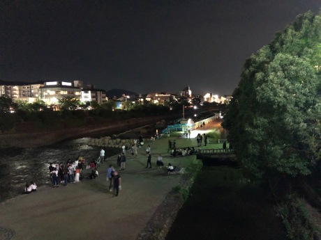
And this is what the riverbank looked like with all of us down on it.

IMG-1099 (1)

It kind of amazes me that we had a group of people this large (most of whom were drinking), and the cops were not called. I mean no one was doing anything awful, but a group of folk that large is going to be loud. And I can only assume that it eventually got annoying for the locals who were just trying to walk along the river bank.

But all good things come to an end, and so did Bitsummit. But I still had a bunch of time in Kyoto. So what did I do? I went to tourist destinations and drew.

Pictured above is Arashiyama. The place where that iconic bamboo grotto is. But I have always loved this view of it, from the outside. There are way less people, and its still just as beautiful.

I also went to Kiyomizudera. Which is the most iconic Buddhist temple in Japan. Unfortunately for me the temple its self was under restoration so it was covered in scaffolding.IMG-1128

But fortunately for me, I actually went there primarily for the sake of seeing all the small little alley ways that lead up to the temple. See Kyoto is one of the few places in Japan where you can still see traditional Japanese buildings still in good condition (you can see them in rural Japan, but they are often a bit run down). And let me tell you, the alley ways leading up to Kiyomizudera are just stunning in their own right.IMG-1123IMG-1125

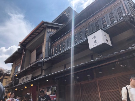
I mean just look at them, they are gorgeous. I wanted to do a world in Kana Quest that referenced these alleyways, but due to the parralaxing backgrounds it would have been near impossible to execute them in a way that would have looked good.

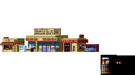
Once I finished mucking around in Kyoto, it was time to go home. And let me tell you, home had not changed one bit. It was exactly as I remembered it. The clouds were even doing my favourite thing where they covered the tips of the mountains. Of course when I say home I mean where I lived. A small town called Wadayama in the dead centre of Hyogo prefecture. Below are some pics of my neighbourhood.  

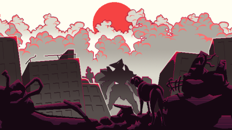
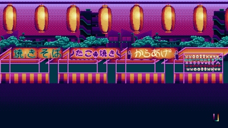
If you were wondering where the first four worlds of Kana Quest came from, this is where they came from. While they don’t look exactly like the real world inspiration, what was more important to me was that the worlds made me feel like I was back here.

But then we have the cherry on top of my nostalgia sundae. The shitty box I lived in for a year. Now the pics just below don’t look that bad… that’s because the moment I moved out. They gutted the insides, repainted the outside and landscaped the surrounding area. Because let me tell you, when I first got there, there was mould everywhere, there were spider webs in my stove top grill, there was a large plastic bucket where a shower should have been (actually that one never got fixed while I was there), and the fridge that I had been left was not working…. And yet… god it was good to be back home.

Also, see that car parked in the third picture? That’s where I used to park my car. But something you cant see so easily is that there is a full two feet drop on the left hand side of that car. So driving into that thing was terrifying because if you messed up… your car was gonna end up on its roof.

IMG-1257

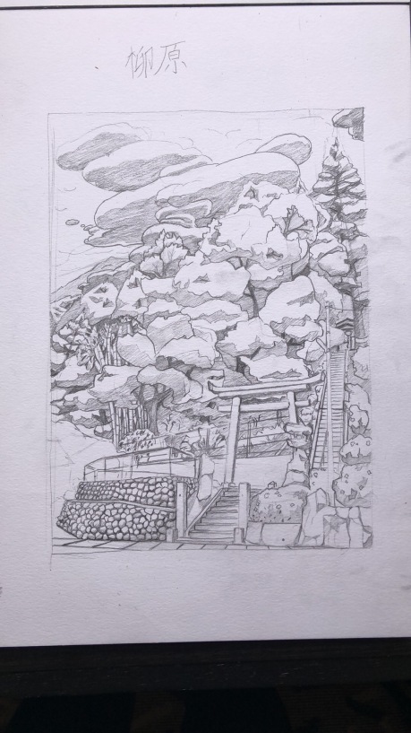
I also decided to do a drawing of the little park next to my home. When I moved in one of my coworkers asked me if being next to the shrine bothered me. She didn’t understand me when I said that I quite liked it because she thought it was scary. Still to this day I think I was very lucky to have something so beautiful next to where I lived.

Now this is starting to get a bit long so I might start wrapping it up. But before I do we are gonna do a few last rapid fire pics and what they are and why they are important.

IMG-1333

My fav Pokemon gets its very first official plushie from the Pokemon Centre, and I am so stoked.

IMG-1328

The Hiroshima Genbaku Dome. I was planning on drawing this one, but when I got there I found it a bit too upsetting to draw. Especially when you look at the pictures of the immediate aftermath and you can see the landscape around you as being nothing but complete devastation, I just found it a bit too much.

IMG-1303

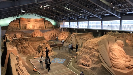
The neighbouring prefecture to my Hyogo to the north west is Tottori prefecture. Which has the honor of being the least populous prefecture in all of Japan. What does it have? Honestly not a lot apart from a lot of natural beauty and sand. Seriously look at these sand sculptures at the Tottori sand museum!

Finally, I have actually been getting some work done while I’ve been over here (I know it doesn’t look like it). Unfortunately most of it isn’t ideal for showing off. But the art for the final mechanic in Kana Quest is now finally implemented. KanaVeyorBeltFinished

In terms of other Kana Quest news, our composers Julian and Leina are working damn hard on the music and I cannot wait to share it with you. And I might get them to write a devblog in the future about what they were trying to achieve with their music.

And with that, that’s all I got for this month. We are going to keep working hard on Kana Quest as we get ready for release later this year. I’ve had a few folk ask me if there is anything they can do to help the game leading up to release. And the answer is pretty simple, tell your friends about Kana Quest. You telling your mates to get excited for this game will do more than anything I do here on this devblog.

Until next time. Take care all!


Hi all and welcome back to the Kana Quest devblog!

This last month was a busy month for Kana Quest development because for the first time, we’ve had to deliver to an “official” deadline. There have been unofficial deadlines before, like PAX and AVCon last year, but those deadlines were a bit fuzzier. They were more “make sure your game is in a presentable state by this time” sort of a deal. This deadline was much more concrete.

So what was this deadline? Well as a part of receiving funding from Film Victoria I have to complete milestone reports to prove to them that their money is being well spent and that I am on track to completion. For this milestone I said I would have the game’s art complete, and the game’s mechanics complete. And… we got there. All that remains at this point in time is bug fixing, level design, tutorials and balancing. That’s actually still quite a lot of things but lets not focus on that. Let’s focus on fun stuff. Like the full list of all the different kinds of Kana in the game!

STONE KANA: These poor kana have been turned to stone, and thus cannot move.

CtStoneHa


MYSTERY KANA: Look at these shifty looking Kana. They’re hiding something… Oh wait they’re hiding their true face! Pay attention to what they do and do not match with to discover their true identity.

mystery


ONE DIRECTION KANA: These Kana can only be moved in one direction. They have a big arrow on their head showing which way that is.

OneD


ICE KANA: These Kana have been encased in super slippery ice. They will keep moving until they can’t. Getting them to go where you want can be challenging.

IceDemo


GHOST KANA: These kana have lingering regrets. Mostly not wanting to pass onto the other side. But that’s no problem, you can bring them back to life if there’s enough friendship to go around. Make a chain of Kana the length of the number on a Ghost Kana’s head and they’ll come back!

GhostKana.gif


SLIME KANA: These gooey Kana don’t like to make friends. But they do like helping other Kana! Attach one of these Kana to any other to change their vowel sound!

SlimeKana

PARALYSIS KANA: These Kana are sick! You can move them once before they turn to stone!

Paralysis


BLUE SLIME KANA: These Slime Kana are a bit picky in which Kana they help. They will only help Kana with an “i” sound. But once they are attached the affected Kana will have two different vowels to match with other Kana. This mimics how the “y” sounding letters in Japanese attach to “i” ending kana to create blended sounds.

Eg. (yo) よ + (ki) き = (kyo)きょ (as in Tokyo)

YaSlimeKana


SHAPE-SHIFTER KANA: These Kana can become anything! Whatever you need them to be, they can be it!

Transform


EVIL SLIME KANA: These Slime Kana nice like the others. They are angry and will stop you from completing a level unless they are attached to another Kana. But they make it harder for you to match with other Kana. This mimics the tenten and maru symbols in Japanese. You attach these symbols to letters to change the consonant. E.g. a (ta) た becomes a だ when you attach those two dots called tenten to it.

MaruKana


JERK KANA: This kana is called “n”. “n” for “n”obody likes them, because they are a jerk. They’re mean, they call the other kana names. They are so unpleasant that other kana cannot be happy if there is one near them. Fortunately there is a way to get rid of them. Move a jerk kana into this little portal thing and they will GO AWAY. Where do they go? Don’t worry about it.


And that is all the Kana! Its been a long road getting all of these in the game, and I can’t wait for you to figure out all the puzzles they are going to make.

Anyway, I’ll see you in the new year! Have a happy and safe holiday season, and from me and the Kana “明けましておめでとう” (Happy new year in Japanese)trailerWIP2


Hi all, welcome back to the Kana Quest Devblog!

A whole lotta stuff has been happening for Kana Quest this month so lets get to it!

Firstly is THE NEWS. There is only one really big piece of news and it came at the end of Melbourne International Games Week last month. Now I had known about this for a while, but I am now officially allowed to talk about it. Kana Quest was successful in receiving Film Victoria Funding in the most recent funding round! I’m really proud of myself for getting this funding, there were a lot of awesome games asking for funding in this round and I was one of the lucky ones to get through.

Here’s a link to the official announcement: http://gamesweek.melbourne/film-victoria-games-investment-greenlights-14-new-projects/

But enough tooting my own horn, onto the new stuff! And as of this month, I can say that Kana Quest’s background art is now 100% complete. Last month there were two more worlds needing to be completed. Well, they’re done now!

world12Complete.gif

So this is world 12 in the game, showing off the parallax effect. So the idea behind the last three worlds was a three part story of a Kaiju (Godzilla type monster) coming to Japan, getting into a fight with a big Mech, and then the aftermath. World 12 is the the fight with the Mech. A couple of small details with this piece. The buildings in the background are the same buildings that appear in World 9 which were based of the main street in Akihabara. These buildings though were scaled down, had their colour changed and had a bunch of bits torn out of them to show the impact the fight was having on them. Also the Mech has a カ on its chest with is the Katakana for “ka” and the Kanji for power (Chikara). I was also going to give the Mech and the Kaiju simple idle animations, but the animation for them and nothing else looked weird. I also chose this colour pallet to make this world feel dangerous and scary. A lot of villains from TV shows have a purple and green colour pallet so I decided to lean into that. Also this world is the first time I’ve used outlines in Kana Quest’s backgrounds. Choosing if you are going to outline in pixel art is one of the biggest stylistic choices you can make, and I decided pretty early on that I wouldn’t use them for the majority of the backgrounds. But As I wanted to draw attention to the Mech and the Kaiju in this world I broke my usual rule.

world13ProcessGif.gif

world13wipBorderOff.png

And here we have, THE FINAL WORLD. So the conclusion to the three world “story arc” is that the Mech has defeated the Kaiju and stands victorious looking to the sun. But in the foreground we see the destruction that the fight has caused. A couple of notes, this scene was definitely inspired by FLCL and the scene where Haruhara Haruko leaves at the end of the series. It had everything I wanted from the final world, it had dramatic imagery and it was used to close one of my personal favourite shows (don’t watch the second season though, its awful).  I also decided to change the sky for this world. Every previous world has had a gradient for their sky. And that gradient was achieved with dithering so I could keep my colour count low. But for this final world I went with a flat off white with a bright red sun in the middle of it so that it would look extra unsettling next to the other worlds, but also to mimic the Japanese flag. I also talked briefly about how I have generally avoided outlines in the backgrounds. In this world I deliberately broke that rule to further hammer home that this world is not like the others. The final little detail that I put in here is the dog at the front. He is my actual real life dog. He always looks very dramatic so I thought he would fit right at home in this world.

Next up is how the game is progressing in terms of Mechanics. And I can say, now that Reuben has been working on the game for a month, very very well! Since coming on board he has cleaned up a bunch of code behind the scenes, added in FIVE mechanics into the game. This brings us up to 9 out 13 mechanics in the space of a month! And now that the world art is done I have even started making art for some of these mechanics.

GhostKanaDemo

This is a Ghost Kana. Ghost Kana, cannot move or match with other Kana. Also you might have noticed, they don’t have a Hiragana/Katakana on their head. This is because once you make a group of Kana with a size equal to a Ghost Kana’s number, they will come back to life as a normal Kana. This is got some great play to it especially when you add in some of the other mechanics. Once all the levels for this mechanic’s world are done I’ll do a break down of this mechanic on how it can be used and how much depth it adds to the game.

So anyway, that’s basically all I have for this month. If you have any questions, please don’t hesitate to ask. Until next time, take care of yourselves and have a good month!


Hi all! Welcome to the DevBlog for Kana Quest, where I document what I’ve been working for the week, and what I’ve learned along the way.

This week I did something I’ve never really had to do for Kana Quest before, and that is draw people in pixel art using very limited amounts of pixels. So this week we will go through the things I made and what the process for doing so was.

But firstly let me give you some context on what I’m making this for. So each world in Kana Quest has its own unique layered background art that repeats so that I can make use of parallaxing. I’m currently working on world 8 which is a homage to John Brack’s 5pm Collins St.

This slideshow requires JavaScript.

You can see in the original there are two rows of people. I’ve finished the first one, and am up to the second. And this is where this weeks topic comes in. See the people in the second row are going to be much smaller than the ones on the foreground and thus I have way less pixels to work with.

 Each of these people range from 21-39 pixels wide and 61 – 88 pixels tall. In other words they are all way smaller than any of the people at the front. Quick heads up, I’m not going to go over how I arrived at my pallet for these people. I’m going to focus on the drawing aspect for this week.

So where did I start with these? Well I started each with an idea of what the person should look like at the end. I know this sounds silly but just having an idea of what you want them to look like will help. I also made a conscious effort to make sure they would all look different from each other. But once I had an idea of what I wanted I would start with the head.

w8PersonHead

I wouldn’t go for anything super detailed, just a roughly head shaped blob. Then I would figure out what shape the head should be using what I was planning and using reference photos. Always use reference photos, if you are anything like me and have the imagination of a gold fish they will be your best friend. For this blog we are going make a caricature that you will probably recognise from sailor moon: the nerdy schoolboy with massive glasses.

neeeeeerd

Gurio Umino from Sailor Moon

For this character, I figured he would have a pretty large and round head. Which also helped create room for his big glasses. I also gave him a bowl cut to make his head even more ball like. Something that I noticed very quickly making these characters is when you have this few pixels shape is really important. You have to express as much as you can from the rough shape of things. This is why I chose glasses boy here as the example for this blog.

w8PersonHead

Once I had the rough shapes blocked out (the face, hair and glasses) it was just a matter of shading everything to give him depth. Now I am not using hard outlines for these people. You are free to do that for your own pixel art if you like, I’m opting not to because it is not in style for Kana Quest. Another thing to pay attention to while shading is to use your shading to imply shape and texture. For example on the glasses I use shading to show how thick and bulky they are. I also use skin shading to show the curvature of his face.

But of course this is just the face. As I said before, for each of these characters I started with the head and worked my way down. The reason I did this is because by starting with the face I can get a good sense of what sort of personality I want to depict. In the case of this one, I wanted him to be pretty stiff and awkward looking. I also wanted him in the classic Japanese School uniform winter blazer. So what I did is I created a basic shape of his body; in this case a rigid rectangle. Then I placed where the hands and feet would go. It’s always easier to place where you want the hands and feet to be and work back towards the body than the other way round. In this instance the hands and feet were just straight next to his body, so it would have been pretty simple either way. Then I drew in the outline of his blazer and finished with shading. Once again keeping in mind that we need to use shading to help the viewer infer what the shape of everything is.

w8PersonBody

And there we have it! A finished person. Now if you excuse me I have another five of these things to make before I can finish making this world.

Anyway I hope you’ve enjoyed this week’s devblog. I unfortunately wont be uploading a devblog next week as I will be exhibiting Kana Quest at this year’s Animaga in Melbourne. If you are coming, please come find me at in the indie game section, say hello and give the game a shot! But until next time, take care and have a great week!

Hi all, this week I finished illustrating the art for World 7 in Kana Quest. And I’m pretty pleased with the end result. So I thought I would go through each of the “work in progress” images and talk about the things I did.

World7Wip

So here we have stage one. I wanted this world to be based around yellows and reds but then balancing it with light blues as the contrast colours. I also try to centre each world around something different, and I hadn’t done Japanese shops yet so I started with the central theme of the world from there. A couple of small details I put in here is the convenience store says Konbi 2. The word for 2 in Japanese is “ni” and “konbi” doesn’t actually mean anything. But if you add them together to make “konbini”, you get the word for convenience store. And on the billboard above, it says “Wayward Strand Coming 2019”, along with a QR Code to their website. I’m putting in a reference to this game because the Art Director (Goldie Bartlett @GhostTownGoldie) helped me out a bunch when I first started working on Kana Quest, and I wanted to acknowledge the help she gave me beyond the credits. The final little detail here is the drive through restaurant is called Zukina and is blatantly ripping off Sukiya a popular Donburi chain in Japan.


World7Wip2

Here’s the next stage. The biggest change here is the massive change of the colour pallet. I mentioned earlier that I wanted to have the yellows and blues contrasting, but the yellows I was previously using were too green, and thus they ended being complimentary with the blue. So I redid the pallet, grounding the shading with a nice warm purple which gives everything a beautiful looking away from a sunset sorta feel. Apart from a couple of small alterations these colours stayed the same until the end. And I feel as though, you should be fine with deciding to change your colour pallet if the current one isn’t working. Every time I’ve done so has resulted in much more striking scenes. Of course if you have too many colours doing so might be a bit tricky, so maybe stick to a few colours to start  with, then change them as needed until you are happy and then use as many intermediary colours as you like.


World7Wip3

Once I was happy with the foreground shops, and colour pallet I moved onto making the background buildings. I have a fair bit of trouble with things that are not in the foreground because you need include less detail, but because it’s pixel art, you need enough detail to properly convey what it is. And to be honest I don’t think I’ve mastered this yet. I probably included too much detail on these background buildings. Also a small quirk about how I make these scenes, because each layer is parallaxing (foreground layers scroll faster than background layers) I have to make sure that the art for the background buildings extends to the lowest point in the foreground shops, otherwise there will holes. But the result is a bunch of artwork that just isn’t seen 80% of the time.


World7Wip4

Next up was completing the shading on the background buildings. There’s not a whole lot to say about this stage, its just a slightly more developed version of the previous image. Except that in this one, I’ve repeated the background buildings so they take up the whole screen. I do this to get a better idea of how it will look in game.


World7Wip5

Next up is the foreground. This is the first time I’ve had an actual person in the foreground. I had people in the stalls in World 5 and some students in World 6. But noting this front and centre. The main reason is lack of courage. I started learning pixel art specifically for Kana Quest. But I finally stopped putting it off and did it. My process was as follows. Create a rough sketch of the outline of the character. Then clean up the lines so everything looks nice and neat. Then block in large areas of colour going over the previously created line art. Finally add in small areas of shading and detailing.


World7Wip6

Last one! There are only two main changes here. Firstly I finished the sky to have the same dither effect used in all the other worlds, and then I gave my young boy a baseball cap. What team is it for you ask? Why, it’s a cap for the Hanshin Tigers: the team of choice in my area of Japan. I decided to give him the cap because he looked like a kid who’s a part of the baseball club at school, and thus would totally be all about his local team.

Fun fact about the Hanshin Tigers, they haven’t won in decades and its all because they got cursed by Colonel Sanders. And no, I’m not making this up. When they last won the championship, their supporters threw a Colonel Sanders statue into the river next to the stadium. Why? Because they thought it would be fun to find lookalikes of team members in the crowd, and then throwing them in the river in celebration. But the Hanshin Tigers had one American player. And they couldn’t find another westerner, so they just threw in a Colonel Sanders statue in instead of a fan. But the following years they went from being the champions to 18 years of ending in last or second last place. So years later they went in and pulled up the statue. But they only found the top half, and the Colonel’s hand was missing. But their performance improved a bit. So a few years later they went looking for the other half, and found it. Once again the team’s performance improved again. And they were now one of the better teams but they kept getting unlucky losses towards the end of the season. So there is a huge bounty on finding the missing left hand, but alas they are yet to find it. The found parts of the statue actually now rest inside KFC Japan’s headquarters.

1200px-Curse_of_the_Colonel_DSCN7774_20090921

Look upon the destroyer of Hanshin Tiger’s fan’s hopes and dreams.


Anyway, that’s all I got for this week. Until next time take care and have a great week!

Hi all, welcome to this week’s Kana Quest Devblog. This week I started work on World 7 in Kana Quest, and as a result I have been looking at a LOT of reference images. And looking at my references, made me start breaking down the different stylistic patterns I was seeing. Then in turn I started thinking about how those patterns affect the feel of a piece. So today we are going to look at a two different techniques/styles in pixel art, and what feelings they convey.

The first technique I want to talk about is the use of outlines. A lot of character art will have strong lines around the character as well as components of the character it’s self. Compare these two pieces of character art.

They both utilise an anime an anime-esque aesthetic but the end result and feel from the two is massive. And the pattern that I’ve noticed is that the lack of borders make a piece of pixel art feel more mysterious. While the inclusion of borders make the piece more concrete.  The piece that really illustrated this to me though was this one.

I love this piece. The reason this piece is so evocative for me is the incredible use of both bordered and border less pixel art. The silhouettes of all the creatures is clearly defined by the borders but the shading is done without. This creates a wonderful push and pull of between the known and unknown. Of course the use of mono directional dithering (seen in the clouds and the antelope monsters fur) further adds to this feeling.


Which brings me to the topic of dithering in general. Depending on how you use dithering it can change the feel of a piece dramatically. In this piece the use of irregular dithering makes the scene even more surreal and mysterious.


mossy_robo_by_sky_burial-d9u76yl

Source: https://sky-burial.deviantart.com/art/Mossy-Robo-594919677

And yet, dithering can also cause a piece to be almost “too real”.

db8c9a9259fa221c720fb700c77fcc92

I tried to find the source of this one, but I couldn’t find it. If you know the source please let me know so I can edit it in!

And I think it all comes down to the type of dithering being used, and the extent that its implemented. What I mean by “the type of dithering” is if the dithering follows a consistent linear progression (as seen in the second image) or if its irregular (seen in the first). Also you can see that in the first image, the use of dithering is far more restrained, whereas the second image uses it basically everywhere. When I first started doing my art for Kana Quest I was definitely using dithering way too much. And I’ve come round to the view that your dithering should be used to create the texture of the piece. In the case of the mossy robot the dithering makes the texture feel kinda chunky and bumpy.

Anyway, while writing this I realised that everything I talked about has a consistent theme. Each of these techniques creates a tension between what is “realistic” and what is “abstract”. Using dithering over flat colours; more abstract (usually). Using outlines and borders makes pixel art more abstract, but more easy to define. And I think something that I want to be more conscientious about going forward is how abstract I’m willing to push the art of Kana Quest.

But before I go check out the progress on the art for  World 7 in Kana Quest. Its coming along nicely so far, though there are a few things I think I’ll have to fix up. I’ve also had a blast hiding as many little references into this one as possible. See if you can find them all. There are three so far. Anyway, until next time have a great weekend!

World7Wip


Hi all, hope you’ve had a good week. Sorry for missing last week’s post but I was out of town and I had mostly been working on funding submissions and trademark registrations. So you know I didn’t have the most exciting content to talk about.

Anyway this week I finished the background art for world 6. And I had a bit of a personal level up moment when it came to the color pallet. See, for world 5 I spent ages trying to settle on a color pallet that I liked. But ultimately I was pretty unhappy with the result.


So here is the color pallet I used, and here is the finished result as implemented into the game. This color pallet worked well until it really didn’t. It worked well until I had to draw the food stalls in the foreground and then everything started falling apart. And while I was making the art for world 6 I finally understood why.

So I started work on world 6 much the same way I started world 5. I made a pallet and started drawing from within that pallet’s constraints.


This worked great for the little bushes up the front of the scene, but I kept getting the feeling that the dirt and the sky just weren’t working. But still I persisted and stuck with my current course.

World6WIP2

But as I added more and more detail I found things just weren’t adding up. Things weren’t as pretty or as appealing as I hoped them to be. And so I found myself questioning the pallet I made. And I didn’t understand why my pallets just weren’t working. But then I realized that the pallets that I had been using had two major problems.

Firstly they don’t allow me to see the colors effectively in context. And secondly once all I had finished blending colors together, despite having 15-20 colors the viewer would only effective perceive all those as three or four distinct colors (Which often didn’t look good next to each other). And so after some extensive research of different color pallets that I thought would work for the scene on Pintrest, I landed on this configuration.World6Pallet2

So, lets dissect what I was trying to do with this pallet. I wanted to be able to see the 4-7 main colors that would define the scene, much like a traditional color pallet. But I wanted to be able to see what colors would be used as the highlight and shading colors for those main colors. This was so that I could get a better idea of how things would look once shaded. Another nice feature I found out while working with this pallet is that I could quickly see how color groups would look together by covering the colors I wasn’t interested in seeing with a finger.

Now there are some draw backs to this system. This system I think works really well for pallets focus on one color with maybe a complimentary color thrown in (for example mostly green and then some yellow). I don’t know how well this system will work for pallets that utilize a lot of contrasting colors. But I guess I will find that one out as I draw later worlds!

Anyway, once I had my new pallet figured out, I went about replacing the old colors with the new and we ended up with this. Which is so much nicer that if I had just stuck with the old pallet.

World6WIP3

Anyway, I will hopefully see you all next week. But until then, have a great weekend!

Hi all, this week on the Kana Quest DevBlog we are going to look at the background art for world 5. And how I went about making it, and what I think works and what I think doesn’t.

World5Gif.gif

So something that I did much more diligently for this world was deciding on a color pallet from the start and sticking to it. A good color pallet is the base of all good pixel art and the fact that I’ve been so lax about it is kind of ridiculous. And I think it worked to mixed success in this piece. The background houses and park look great within the pallet, but the focus of the piece; the market stalls are less than stellar. w5wip.jpg

As you can see with my first work in progress picture, the park scene starts off pretty good. There is a pretty limited use of the pallet and it looks pretty swanky.

w5wip2.jpg

Then I moved onto the houses behind the park and still the color pallet held out and kept looking great. And not just great, I felt this world was shaping up to be one of my best ones yet. But things all went downhill when I added the stalls.

w5wip3

I don’t know what it was but I did and redid the stalls so many times and they never turned out quite right. I was using the “correct” colors in the pallet, so why did they look so out of place? Honestly I don’t know all I know is, if I’m going to keep deciding on a color pallet at the start I’m going to need to be more careful with the colors that I pick and start with the highest detail thing and then work towards the lowest detail thing.

If you have any tips and tricks that you use for nailing your color pallet please leave them in the comments! I really want to get better at constraining my color pallets down!

Anyway, its a bit of a short DevBlog this week. Hope you have a great weekend!

Hi all, welcome to the Kana Quest Devblog. This week I’ve been working on making Kana Quest a new logo. Now I’m not going to show the new logo here until it’s 100% done and its been submitted for its trademark application. But I am going to talk about some of the issues I’ve had with the original logo, why pixel art logos are so hard to make, and some of the visual language I’ve learned this week.

Original Logo Issues:

So, lets have a quick look at the original Kana Quest logo. And go over why I’ve concluded this isn’t a very effective logo.

KanaQuestTitleScreenImg

  1. It doesn’t have a clear and readable silhouette. English speakers are strange as most of our ability to quickly identify words come from a word’s silhouette. Because this does not have a clearly visible shape, it is really hard to read at a distance. Give it a try now, stand back from your computer or phone and try read this logo. You probably can’t it all just appears as a blob of different colors.
  2. It is massive in terms of pixel usage. This logo is not small. and it is not scale-able to smaller sizes. The problem with this is that many store fronts have strict specifications of how big your logo can be. And quite simply, the old logo will not fit those specifications. Not matter how hard I try I will never get this logo to fit into a 231×87 pixel image (the smallest image size used in Steam). Also the fact that the logo is less readable than the “press any key” sign under it is all the more damning seeing as how many more pixels it was given to work with.
  3. You need to speak Japanese to read the full title. Seriously, you would think I would have picked up on that problem when I made this but hey.
  4. Contains very little Japanese visual language elements. I’m not talking about the letters here, I’m talking about the visual features and bits of visual language that are often utilized in Japanese logo making. If I had used these elements then they would infer to the viewer that this game has something to do with Japan even before they see the Japanese written.
  5. Very little contrast to guide the viewers eye. So generally speaking we will focus on the part of an image that has the most contrast in value. If you don’t know “value” is how light or dark a color is.  Look at the greyscale version of the image, there is more contrast in the background that there is on the actual logo. So you spend most of your time looking at the wrong thing.logogreyscale

Things to Do/Not Do When Making Pixel Art Logos:

So, the original logo is bad. Really bad. But if you were thinking making your own Pixel Art Logo what are some things should you do and look out for?

  • This is an obvious one, but I genuinely didn’t do it when I made the first logo; Look at lots of other logos. Find logos with the same the feeling that you want to evoke in your viewer. What are the common elements between those logos? What’s different? How do those differences affect the feeling you get from the logo? Once you’ve done that borrow those common elements and use them in your own work.
  • Draw a bunch of logo’s on paper before you start. I made the first Kana Quest logo going straight into pixel art. This was a mistake. Its really hard to effectively try out ideas when you are drawing within the a constraints of pixel art. Below is a logo I made sketching straight into pixel art within Photoshop. While it is better than the original logo, its honestly half as good as some of the warm up sketches I did in paper this last week. If you find it easier to sketch digitally than physically then do that instead, but do some non-pixel art sketches first.

AnimatedLogo1Gif

  • Beware of overlapping shapes (for example overlapping letters). This is less dire if you have more pixels to work with, but overlapping shapes require a lot of defining so the viewer can easily process what’s on top and what’s underneath. And if you are using pixel art, you might not have the pixels to do this. This isn’t a “avoid at all costs” rule, but it is something to be careful of while you are sketching (Also you might notice that I have overlapping letters in the original logo, and it just makes things harder to read).
  • Check that your logo looks good on many different backgrounds. Its fine to have a background color that makes your logo “pop” the most, but if it looks bad on flat black, white or grey there is a good chance you’ve made a mistake.
  • Don’t go with your first design. Seriously, don’t I don’t know why I decided I thought it was a good idea to do so for the first Kana Quest logo, but it was a terrible idea. Don’t fall into that trap.


Japanese Logo Visual Language:

So while I was doing research for my logo this week I wanted to figure out what were  the most commonly used pieces of visual language used in Japanese game logos. And I ended up identifying three common elements (all of which I’ve utilized in my new logo). And of course, not all Japanese game logos use these elements, but a very large amount do. And they use these elements more often than western games.

To this end, look at the Japanese logos for Pokemon Sun and Moon. These logos are great for demonstrating three aspects of design that are common across a large amount of Japanese game logos.

JapaneseGameLogos.jpg

So the common elements are as follows.

  1. Letter Stroke Border:  So most logo’s will have some form of border around the title text of the game. These borders have a large amount of variation depending on the type of game. The width, the roundness/sharpness, the color and shading of the border are all important of communicating the game’s identity. The reason I bring this up as a feature of Japanese visual design is that it is far more common for there to be no border around the letters in a western game’s logo. For example the logo of Skyrim has just the plain text and no border. Or you could look at Dark Souls: A Japanese game that has a deliberately western looking logo by omitting the letter border.
  2. Subheading: While not as commonly used as the letter border, this is a far more commonly used aspect of design than in western games. The most common use of the subheading is to write the name of the game again in a more easily readable text. Often games with a name written in Kanji or English will have the name written out in subheading in Katakana or Hiragana for this very purpose. Another common use is a brief description of the game or as a visual ” : “. The main variations between subheadings are the placement, and font differentiation. Also subheadings are way more likely to forgo a Letter Border than the main logo.
  3. Visual Flourishes:  These are the least distinctive to Japanese logo design when compared to the first two, but they are an important part of the design. These flourishes are often incorporated into the Title’s letters and often use something emblematic of the game (see the pokeball and the Lunala/Solgleo symbol in the Pokemon Sun/Moon logo).


Anyway, that’s all there is for this week. I look forward to being able to show you the new logo when its safe for me to do so, but until then have a great week!